Android 17 QPR1 Beta 3: System UI Adds More Blur to Pixel
Why It Matters
The enhanced blur deepens user immersion and reinforces Google’s push for a cohesive, Dynamic Color‑driven Android experience, setting a new visual benchmark for OEMs and app developers.
Key Takeaways
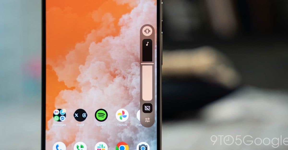
- •Android 17 QPR1 Beta 3 adds blur to volume slider container.
- •Power menu now features translucent background with Dynamic Color.
- •Expanded blur improves depth perception across system UI elements.
- •Google continues Material 3 Expressive redesign rollout for Android 17.
- •OEMs likely to adopt blur effects in their custom skins.
Pulse Analysis
Google’s Android 17 QPR1 Beta 3 pushes the visual language of Material 3 Expressive further by layering translucent blur across core system components. The volume slider now sits inside a pill‑shaped, semi‑transparent container that lets the home screen peek through, while the full‑screen volume panel and long‑press power menu adopt the same frosted‑glass effect. Coupled with Dynamic Color, which extracts hues from the wallpaper, the blur creates a sense of depth without sacrificing legibility. Early testers report a smoother, more immersive navigation experience that feels lighter on the eyes.
From a business standpoint, the rollout signals Google’s commitment to a unified aesthetic that OEMs can inherit, reducing fragmentation in the Android ecosystem. By standardizing blur and dynamic theming, device manufacturers can save engineering resources while still delivering a premium look that rivals Apple’s iOS translucency. The visual upgrade also opens new advertising opportunities within the system UI, as brands can leverage the semi‑transparent backdrop for subtle promotions. Moreover, developers gain a consistent design baseline, simplifying UI adaptation across diverse hardware.
Looking ahead, Android 17 Beta 4 is expected to extend blur to the widgets picker and possibly the notification shade, completing the translucency roadmap. Performance will be a key metric; Google claims the effect is GPU‑accelerated to keep battery impact minimal. Accessibility teams are already testing contrast ratios to ensure readability for low‑vision users. As the blur matures, we can anticipate tighter integration with third‑party launchers and a richer ecosystem of Dynamic Color‑aware apps.
Android 17 QPR1 Beta 3: System UI adds more blur to Pixel
Comments
Want to join the conversation?
Loading comments...