Apple’s Liquid Glass Design Backfired on Most Macs — Here’s What’s Changing
Companies Mentioned
Why It Matters
The UI mismatch can hinder productivity and erode user confidence, highlighting the need for software to align with current hardware capabilities. Apple’s corrective redesign aims to preserve brand cohesion while protecting its reputation for seamless user experiences.
Key Takeaways
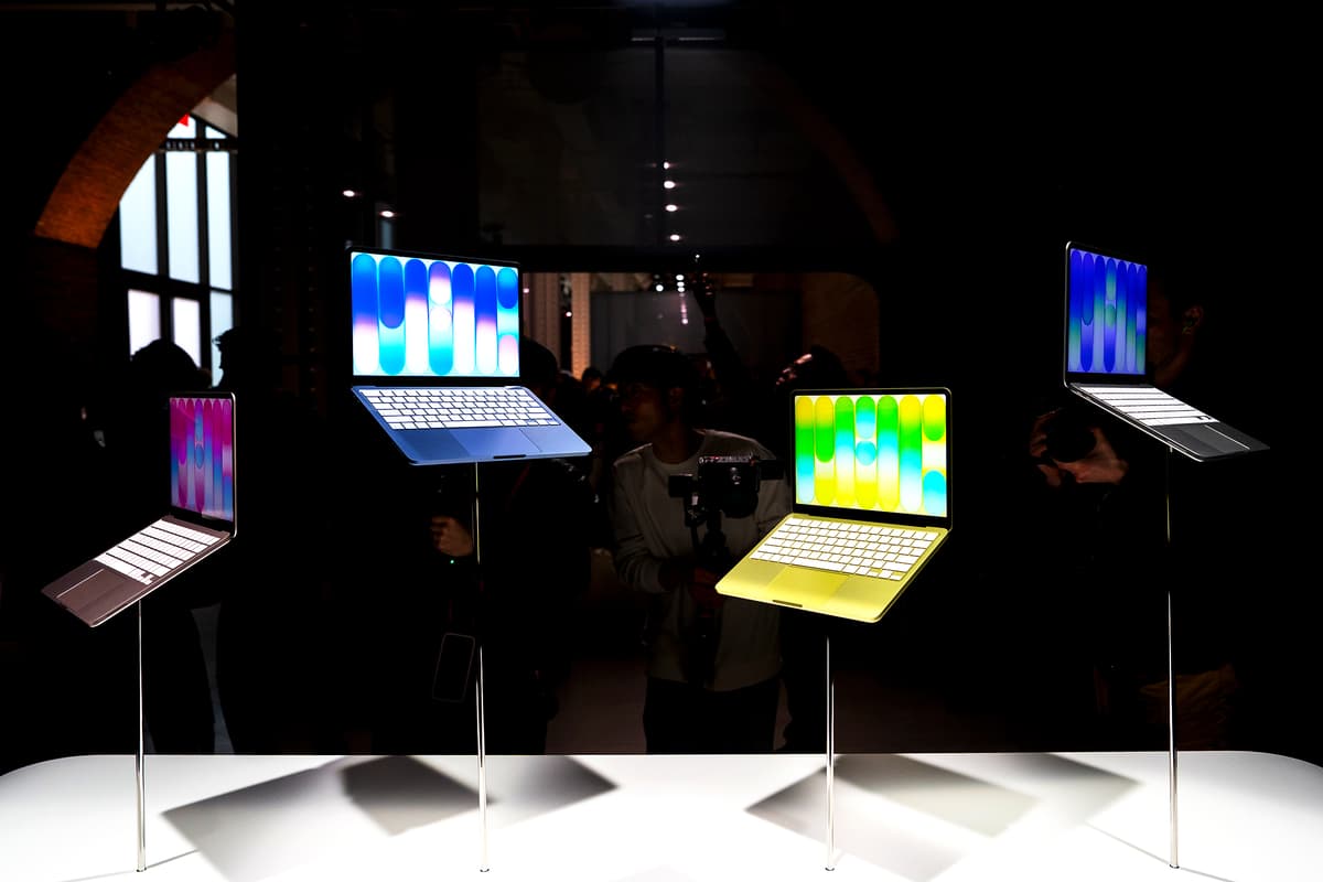
- •macOS 26’s Liquid Glass UI designed for OLED, not LCD Macs.
- •Transparency effects reduce text readability on most current Mac displays.
- •Apple plans a “slight redesign” for macOS 27 to improve legibility.
- •Update will debut at WWDC June 8, keeping the glass aesthetic.
Pulse Analysis
Apple’s Liquid Glass interface debuted with iOS 26, offering translucent panels, subtle blur, and a glass‑like sheen that leverages the deep blacks and high contrast of OLED screens. The visual language quickly became a hallmark of the 2026 ecosystem, reinforcing Apple’s push for a unified aesthetic across devices. When macOS 26, codenamed “Tahoe,” adopted the same treatment, the intention was clear: a seamless transition from iPhone to Mac. However, the majority of Macs still ship with LCD panels that lack the pixel density and true blacks required to render the effect cleanly.
The result is a UI that looks airy but sacrifices legibility; transparent windows and shadowed text blend into the background, forcing users to strain their eyes during routine tasks. Early feedback from power users and enterprise IT departments highlights slower document review and increased error rates, especially in bright office lighting. Apple’s design philosophy traditionally ties software advances to hardware upgrades, but the timing here is off—new visual features arrived before a corresponding refresh of Mac displays, exposing a rare coordination gap in the company’s otherwise tight ecosystem.
To remedy the mismatch, Apple is rolling out a “slight redesign” in macOS 27, slated for reveal at WWDC on June 8. Insiders say the update will dial back translucency, introduce higher‑contrast elements, and add optional “classic” themes for legacy LCD models, while preserving the overall glass motif for future OLED‑ready Macs. For developers, the change means re‑testing UI components against new contrast guidelines, but it also reassures enterprise buyers that Apple remains attentive to real‑world hardware constraints. The move underscores the importance of synchronizing software aesthetics with the capabilities of the devices that actually reach consumers.
Apple’s Liquid Glass Design Backfired on Most Macs — Here’s What’s Changing
Comments
Want to join the conversation?
Loading comments...