Marathon's Vault Stash Is Too Small and Too Cumbersome
•March 6, 2026
0
Why It Matters
Insufficient inventory space and poor UI increase player friction, risking lower retention and reduced monetization in Marathon’s live‑service model.
Key Takeaways
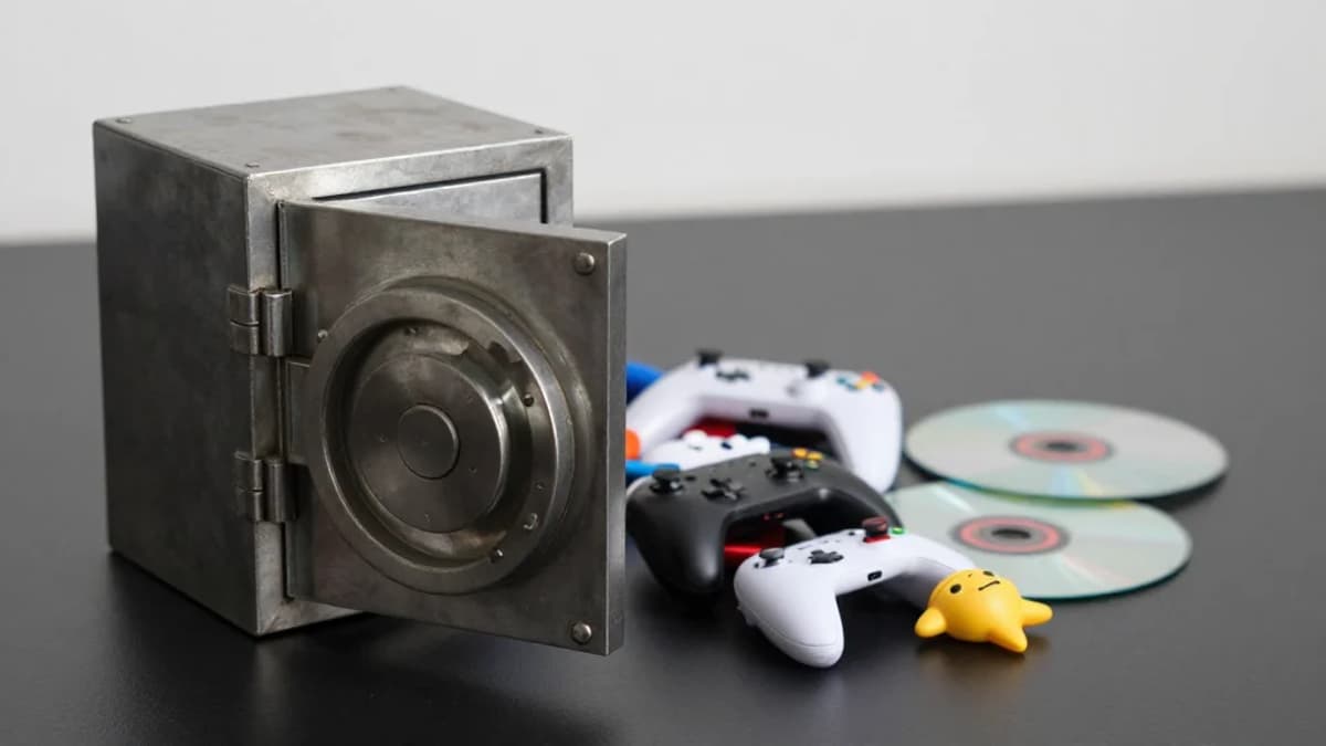
- •Vault starts with 160 slots, large items consume many
- •Weapons occupy eight slots, mods only two slots each
- •Upgrade costs 28,500 credits plus resources
- •Identical icons hinder quick item identification
- •Seasonal wipes erase progress despite vault upgrades
Pulse Analysis
Marathon follows the extraction‑shooter tradition of rewarding players with progressively better gear, but its vault design imposes a hard ceiling on how much loot can be hoarded. With only 160 slots and high‑slot weapons eating up eight spaces each, veterans find themselves forced to cull gear after just a few successful runs. This scarcity mechanic, while intended to curb "gear fear," clashes with the genre’s loot‑driven loop, where players expect to amass and showcase powerful loadouts over time.
The user interface further erodes the experience. Identical icons for distinct body‑part implants mean players must hover over each item for a textual description, a process that feels especially tedious on consoles where the cursor system is optimized for mouse input. Compared to peers like Escape From Tarkov or Arc Raiders, Marathon’s menu navigation feels archaic, slowing down inventory management and increasing the cognitive load on newcomers still learning the game’s iconography.
From a business perspective, the cramped vault and cumbersome UI risk higher churn rates. Players may abandon the title before they invest enough time to justify the 28,500‑credit upgrade cost, especially when seasonal wipes reset progress every three months. Addressing these pain points—either by expanding base vault capacity, streamlining icon differentiation, or improving controller‑friendly navigation—could boost player satisfaction, extend session length, and ultimately enhance the game’s monetization potential.
Marathon's vault stash is too small and too cumbersome
0
Comments
Want to join the conversation?
Loading comments...