Mario Kart World Dev Discusses How the Map Was Designed
Why It Matters
The approach demonstrates how intuitive UI can turn a complex open‑world racing game into an easily navigable experience, boosting player immersion and creating new branding opportunities for Nintendo.
Key Takeaways
- •Map hierarchy prioritizes tracks, then roads, then land visuals
- •Miniature dioramas create instantly recognizable track icons
- •UI design balances brightness, saturation, and detail for clarity
- •Map integrates with loading screens and online voting for navigation
- •Designed map became merchandise, extending the game’s brand presence
Pulse Analysis
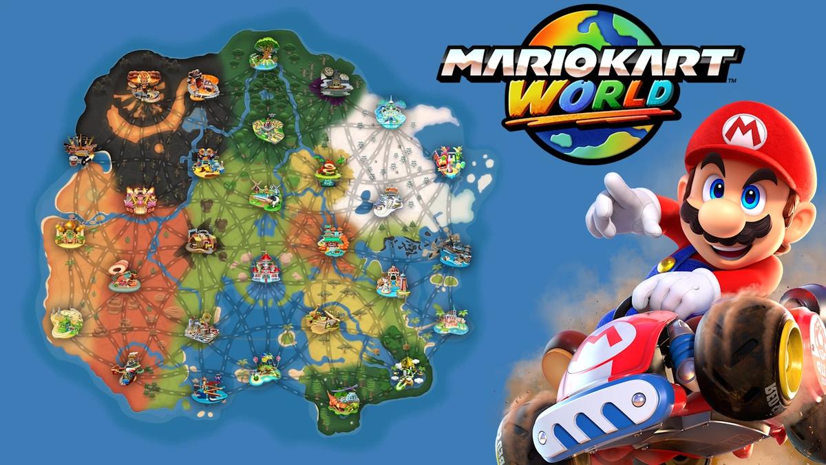
Nintendo’s shift from discrete circuits to a sprawling, interconnected world in Mario Kart World presented a unique UI challenge: how to convey a massive play area without overwhelming the player. Traditional racing titles rely on simple track selectors, but an open‑world map demands a clear visual language that instantly tells gamers where they are and where they can go. By establishing a three‑tier hierarchy—tracks, roads, then land—Nintendo ensures that the most critical navigation cues dominate the player’s eye, while secondary details fade into the background, preserving focus on gameplay.
The creation of the map’s icons illustrates a meticulous blend of physical prototyping and digital refinement. Designers built palm‑sized dioramas of each course, then translated those miniature scenes into stylized, high‑contrast icons. This tactile approach allowed the team to capture signature moments and landmarks, then fine‑tune brightness, saturation, and detail density for optimal readability at a glance. The result is a set of instantly recognizable symbols that reduce cognitive load, letting players select a track with confidence and excitement, a principle that aligns with broader UI/UX best practices in gaming and beyond.
Beyond navigation, the map functions as a brand asset. Integrated into loading screens, online voting interfaces, and even physical merchandise, it reinforces the game’s identity across multiple touchpoints. This multi‑channel strategy not only deepens immersion but also opens ancillary revenue streams—a model other developers are likely to emulate as games become increasingly service‑oriented. Nintendo’s map design thus exemplifies how thoughtful UI can enhance user experience while simultaneously expanding a franchise’s commercial footprint.
Mario Kart World dev discusses how the map was designed
Comments
Want to join the conversation?
Loading comments...