
Recent Posts
Social•Feb 19, 2026
Energy and Materials Surge as Tech Falters in 2026
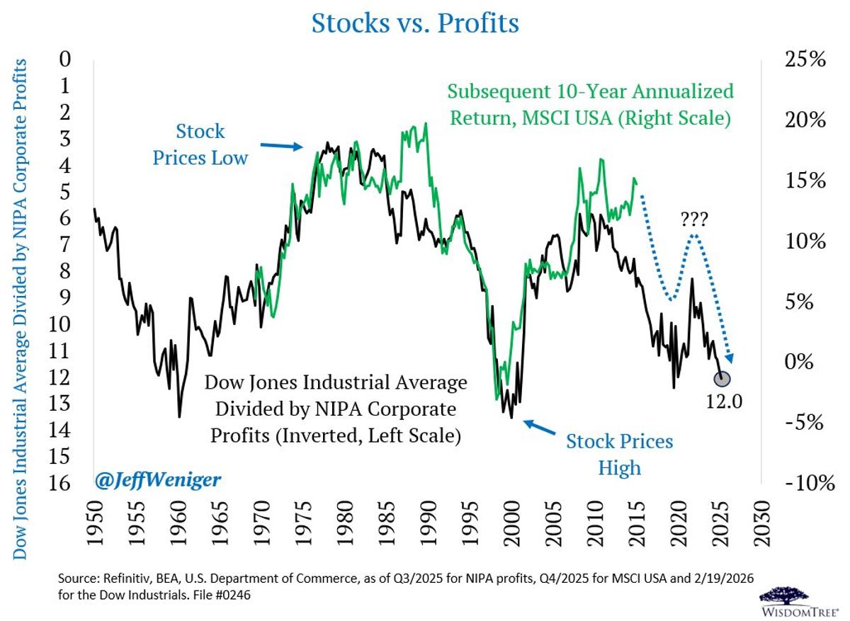
This is a pretty cool chart to show your investment committee. A classic stock price-to-corporate profits image that reveals extended conditions reminiscent of the turn of the century. If this chart has any prescience, we should remember that the leaders of the 1990s (Tech, Media and Telecom) all rolled over after the chart reached its extreme in 1999-2000, with subsequent 10-year returns for the MSCI USA index going negative from that point. That cycle gave way to newfound rewards in Energy and Materials stocks, and in turn, Value plays in the century's first 7 years. Anyone following the 2026 action should have antennae up, because the 2023-2025 darlings, Tech & Comm Services, are the 2nd and 3rd-worst performers of the S&P's 11 sectors in 2026, with both sectors down thus far. In contrast, #1 and #2 are Energy (+23%) and Materials (+17%), both of which have been generally unloved for several years.
By Jeff Weniger
Social•Feb 17, 2026
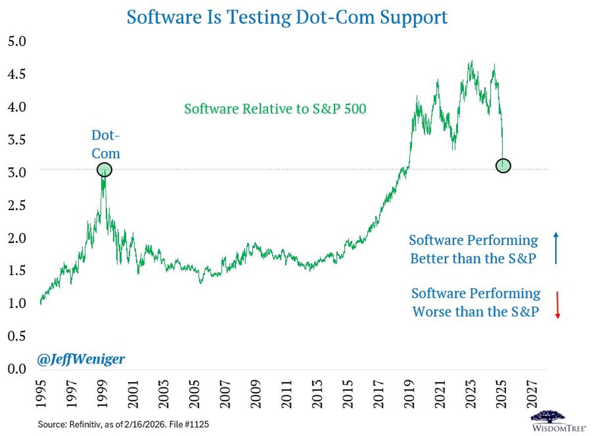
Software Stocks Echo Dot‑com Highs, Risk Imminent Crash
The carnage brings us back to the Dot-Com highs on Software Relative to the S&P 500. Ugly ugly ugly. I don't know if it happens this week, but I think this chart will break down. Time will tell. https://t.co/d0hCRxotxq
By Jeff Weniger