For Module and Its Specialty Coffee, Every Detail Is Deliberate
Key Takeaways
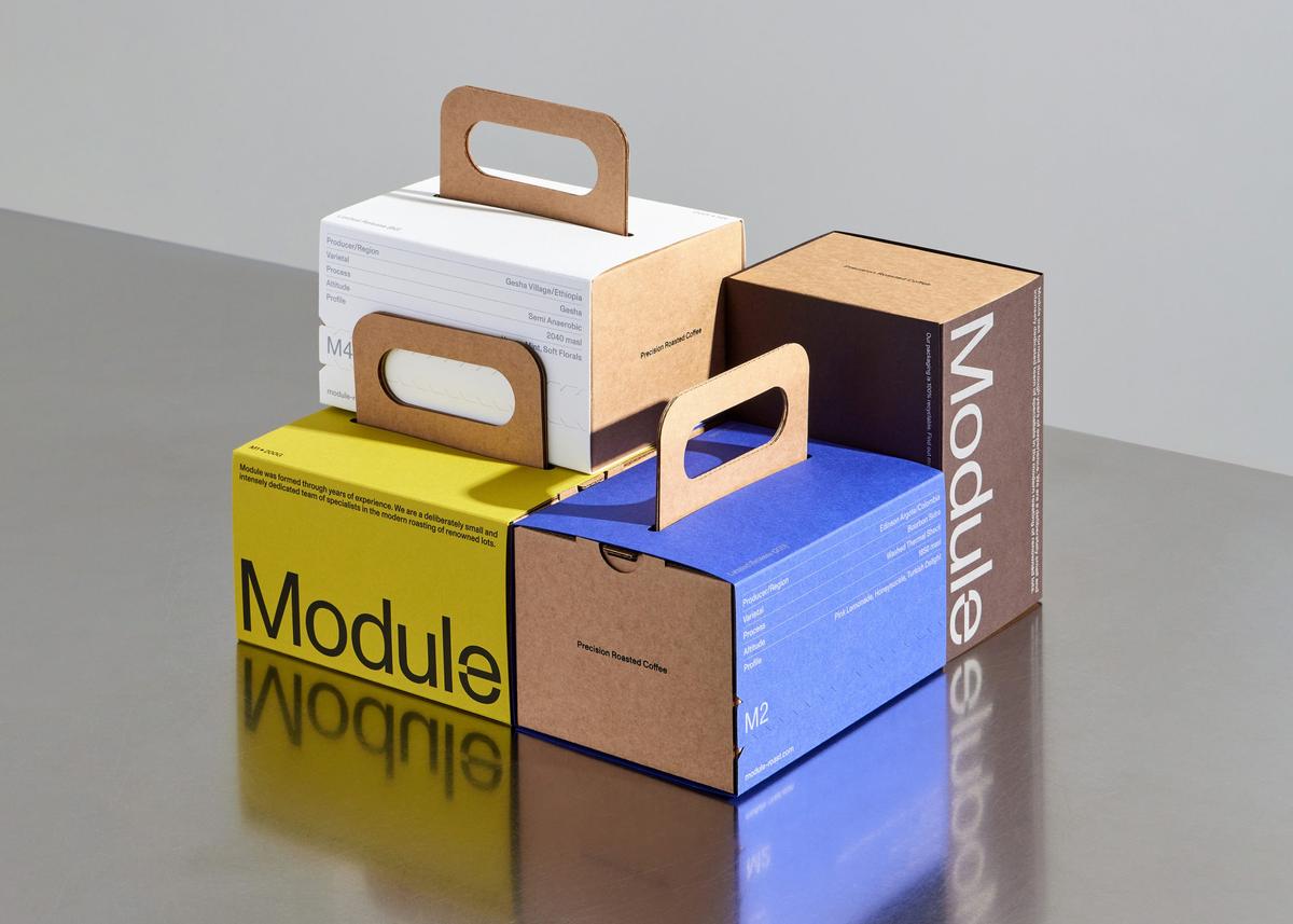
- •Module's packaging mimics toolboxes, emphasizing utility over ornamentation
- •Standard Format used discontinued G.F. Smith paper, adding rarity
- •Frosted three‑layer inner bags mirror outer box's die‑cut hand‑hold
- •Minimalist design reinforces Module's limited‑release, high‑end coffee positioning
- •Utility‑styled packaging may set new standard for specialty coffee branding
Pulse Analysis
The specialty coffee industry has long celebrated elaborate, hand‑drawn packaging that mirrors the artistry of the brew itself. Module’s latest release upends that tradition by embracing a stark, utilitarian aesthetic reminiscent of industrial toolkits. This visual pivot not only catches the eye of design‑savvy consumers but also challenges the notion that premium coffee must be wrapped in ornate graphics, opening space for a new minimalist narrative.
Standard Format’s collaboration with Module showcases a meticulous material strategy. By sourcing discontinued paper stock from G.F. Smith, the designers inject a sense of rarity and sustainability into the packaging, while the rigid kraft‑board box and frosted three‑layer inner bags create a cohesive tactile experience. The die‑cut hand‑hold on both the outer and inner layers reinforces the functional theme, turning the unboxing into a deliberate, almost ceremonial act that aligns with contemporary art publishing trends.
From a business perspective, this packaging innovation serves as a powerful brand differentiator. In an increasingly saturated market, the utility‑styled design signals premium quality and thoughtful curation, likely resonating with consumers who value both aesthetic minimalism and environmental consciousness. As other roasters observe Module’s approach, we may see a broader industry shift toward purposeful, story‑rich packaging that balances form, function, and sustainability.
For Module and its Specialty Coffee, Every Detail Is Deliberate
Comments
Want to join the conversation?