Schweppes Reclaims Its Brand With JKR Instead of Reinventing
Key Takeaways
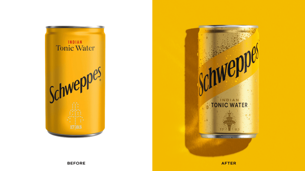
- •JKR redesign gives Schweppes cans a warm yellow palette
- •Diagonal stripe adds movement, luxury without illustrations
- •Gold-toned 1851 Great Exhibition fountain links heritage to modernity
- •Packaging revamp aims to attract shelf attention and younger consumers
Pulse Analysis
Heritage brands are finding new life on grocery aisles by emphasizing their storied pasts rather than chasing fleeting trends. In the beverage sector, packaging has become a primary battleground for consumer attention, with retailers reporting that visual appeal can sway purchase decisions up to 30% of the time. Schweppes’ latest redesign taps into this dynamic, marrying classic iconography with modern design cues to create a product that feels both familiar and fresh.
Jones Knowles Ritchie’s approach is deliberately restrained: a warm, radiant yellow replaces the previous muted tones, while a bold diagonal stripe injects a sense of motion without relying on overt illustration. The centerpiece—a stylized rendition of the 1851 Great Exhibition fountain—serves as a subtle nod to the brand’s 250‑year lineage, rendered in tonal gold to evoke luxury. Such design choices resonate with consumers who value authenticity and storytelling, reinforcing the perception that Schweppes is a timeless, yet relevant, choice.
For Schweppes, the visual overhaul is more than aesthetic; it’s a strategic move to reclaim shelf prominence amid a crowded soft‑drink landscape. By leveraging heritage as a differentiator, the brand can attract both longtime loyalists and younger shoppers drawn to retro‑inspired packaging. If the redesign translates into increased foot‑traffic and higher conversion rates, it could set a benchmark for other legacy beverage companies seeking to revitalize their market position through design‑driven brand rejuvenation.
Schweppes Reclaims Its Brand With JKR Instead of Reinventing
Comments
Want to join the conversation?