Gravita Pours Out a Clean Typographic Approach With Lan Wines Refresh
Key Takeaways
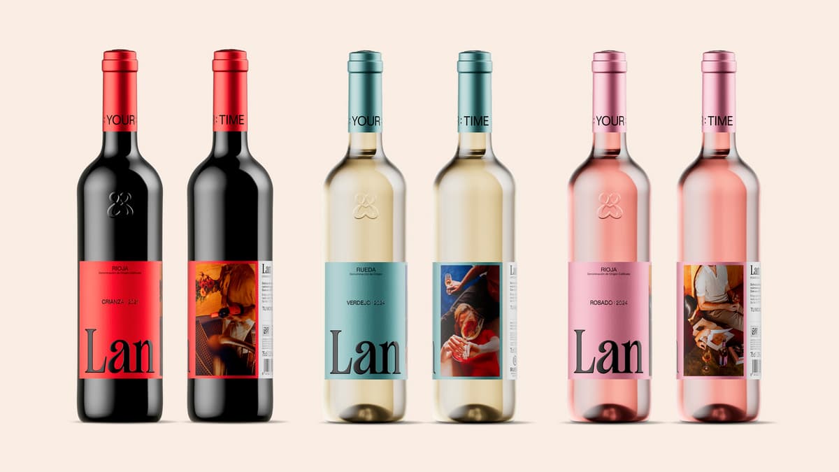
- •Gravita simplifies Lan wine labels with bold single-word typography
- •Enlarged 'Lan' logo becomes central visual anchor across range
- •Color palette assigns distinct contemporary tones to each varietal
- •Design shift reduces clutter, enhancing shelf visibility and brand confidence
Pulse Analysis
Minimalist packaging has become a defining trend in consumer goods, and wine is no exception. Designers are leveraging clean typography to cut through noisy retail environments, allowing brands to communicate quality and heritage without visual overload. Gravita’s approach with Lan exemplifies this movement, using a single, enlarged wordmark to create instant brand recognition while freeing space for other design elements. This strategy aligns with research showing that uncluttered labels improve purchase intent, especially among millennial and Gen‑Z shoppers who value clarity and authenticity.
The Lan refresh introduces a disciplined colour system where each varietal—red, white, rosé—is assigned a contemporary hue that differentiates it on the shelf yet feels part of a cohesive family. By anchoring the design around the bold "Lan" logotype, the label hierarchy is inverted: the brand name now leads, while varietal information recedes into subtle colour cues. This not only streamlines the visual hierarchy but also enhances readability from a distance, a crucial advantage in crowded wine aisles where seconds decide a buyer’s choice.
For the broader wine industry, Gravita’s typographic‑first methodology signals a shift toward brand‑centric storytelling through design. As retailers allocate more shelf space to premium and boutique offerings, clear, confident labeling can command higher price points and foster loyalty. Early adopters like Bodegas Lan may see incremental sales growth as consumers gravitate toward the perceived modernity and professionalism of the new look. The success of this refresh could inspire other producers to prioritize typography and colour discipline, reinforcing the role of design as a strategic asset in the competitive wine market.
Gravita Pours Out a Clean Typographic Approach With Lan Wines Refresh
Comments
Want to join the conversation?