Interactive Map Shows Home-Value Disparity Across ATL Neighborhoods
Why It Matters
The divergence underscores widening equity gaps for homeowners and signals where investors and policymakers should focus resources to stabilize declining neighborhoods.
Key Takeaways
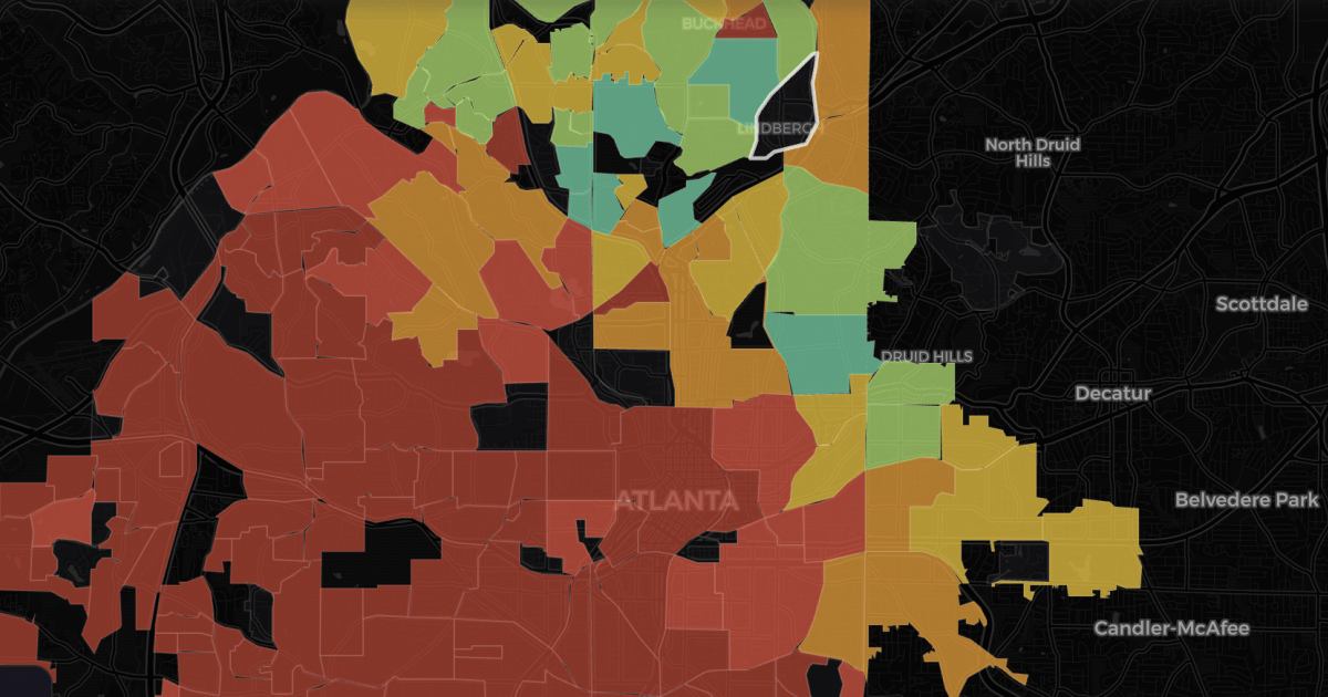
- •Top Atlanta neighborhoods gained 5‑6% annual home value since 2021
- •Southwest neighborhoods lost up to 7% value, eroding equity
- •Interactive map uses Zillow data and AI Claude for visualization
- •Future price shifts linked to new employers, mixed‑use projects, Beltline
Pulse Analysis
The launch of the Atlanta Neighborhood Appreciation Map offers a data‑driven lens on the city’s post‑pandemic housing dynamics. By merging Zillow’s Home Value Index with AI‑generated visualizations, the map isolates single‑family home trends across more than 200 intown districts, exposing a pronounced K‑shaped recovery. While legacy affluent enclaves continue to climb at 5‑6% per year, a swath of lower‑priced neighborhoods—primarily southwest of an Ormewood‑Park to Buckhead line—have experienced price declines of up to 7%, eroding homeowner equity and amplifying wealth disparity.
For homeowners, the map’s granular insights translate into tangible financial risk. Equity loss in declining areas can constrain refinancing options, limit mobility, and reduce resale proceeds, especially for families whose wealth is tied to primary residences. Investors and developers can leverage the forecast layer to pinpoint emerging opportunities, such as neighborhoods poised for uplift following new corporate campuses or Beltline extensions. Municipal planners, too, gain a diagnostic tool to target affordable‑housing interventions, infrastructure upgrades, and tax incentives where market forces are pulling values downward.
Looking ahead, the interplay between development projects and housing appreciation will likely intensify. The Beltline’s continued expansion, coupled with mixed‑use projects and corporate relocations, can catalyze rapid price appreciation, as the map’s author notes. However, without proactive policy measures—like inclusionary zoning or community land trusts—these gains risk further entrenching the K‑shape. Stakeholders should monitor the map’s updates, integrate its insights into strategic planning, and consider collaborative approaches that balance growth with equity to ensure Atlanta’s housing market serves a broader cross‑section of its residents.
Interactive map shows home-value disparity across ATL neighborhoods
Comments
Want to join the conversation?
Loading comments...