Why It Matters
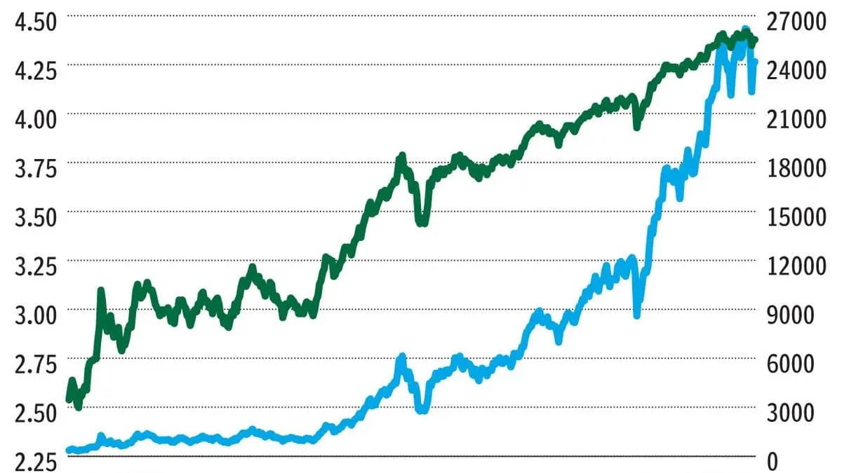
Log charts let analysts compare assets with vastly different price levels on a common percentage basis, improving insight into market volatility and long‑term performance.
Key Takeaways
- •Log charts plot percentage changes, not raw price moves.
- •They compress large price swings, revealing long‑term trends.
- •Excel’s LOG function quickly converts prices for logarithmic scaling.
- •Ideal for comparing assets with vastly different price histories.
Pulse Analysis
Logarithmic scaling translates raw price numbers into their logarithmic equivalents, effectively measuring the percentage change between points rather than the absolute difference. In practice, a move from $0.06 to $0.12 and a move from $0.18 to $0.36 both represent a 100% gain, and on a log chart they occupy the same vertical distance. This property stems from the mathematical definition of logs, where equal ratios produce equal differences on the axis, making the chart a natural tool for visualising proportional growth.
For investors and traders, the primary advantage of a log chart is its ability to tame extreme volatility. During periods like the 2008‑2009 financial crisis or the 2020 COVID‑driven sell‑off, absolute‑price charts can appear jagged and misleading, while log charts smooth out those spikes, highlighting the underlying trend. Over multi‑decade horizons—say a stock climbing from $0.02 to $60—the log view preserves early‑stage movements that would otherwise be compressed into a flat line on an absolute scale, enabling better comparative analysis across sectors and market caps.
Implementing log charts is straightforward with modern tools. Excel’s =LOG() function or built‑in log‑scale options in platforms such as Bloomberg, TradingView, and MetaStock allow users to switch axes with a click. Best practice suggests using log scales when analyzing assets with price ranges spanning more than a factor of ten, or when assessing long‑term performance. Conversely, short‑term traders focused on raw price levels may still prefer absolute charts. Understanding when and how to apply logarithmic scaling equips professionals with a clearer, more nuanced view of market dynamics.
Simply Put: Logging the absolute chart
Comments
Want to join the conversation?
Loading comments...