Thankfully, Purdey’s Energy Drinks Offer Up Some Seriously Non-Aggro Branding
Key Takeaways
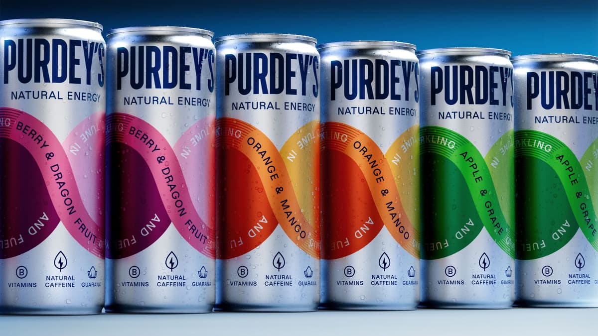
- •Magpie Studio created “Flow Loop” infinity design
- •Flavor‑coded colors replace neon, mimic real fruit hues
- •Calm typography signals wellness, not aggression
- •Design links cans visually on shelf
- •Targets health‑conscious, younger consumers
Pulse Analysis
Packaging has become a decisive factor in the crowded energy‑drink market, where shelf visibility can make or break a brand. Purdey’s partnership with Magpie Studio illustrates how a strategic visual overhaul can transform perception, moving away from the neon‑filled aggression that once defined the category. By introducing a unifying “Flow Loop,” the brand not only differentiates its cans but also creates a narrative of continuity and trust, aligning with consumers who scan shelves for cohesive, premium‑looking options.
The design language leans heavily on color psychology and functional aesthetics. Flavor‑coded palettes draw directly from real fruit hues—Berry & Dragon Fruit, Orange & Mango, Apple & Grape—providing an instant visual cue that reinforces natural ingredient claims. Calm, purposeful typography replaces the jagged, high‑energy fonts typical of the sector, signaling a wellness‑first mindset. The infinity ribbon wraps each can, acting as both a brand identifier and a compositional device that visually links neighboring products, encouraging shoppers to purchase multiple flavors in a single glance.
For the industry, Purdey’s rebrand signals a pivot toward authenticity and health‑centric branding. As Gen Z and millennial consumers prioritize transparency and lifestyle alignment, energy‑drink makers are rethinking aggressive marketing in favor of designs that convey calm confidence. This shift could drive incremental sales for Purdey’s, especially if the visual strategy translates into perceived product quality. Moreover, competitors may follow suit, accelerating a broader redesign wave that emphasizes natural imagery, cohesive shelf storytelling, and a softer visual tone across the functional beverage landscape.
Thankfully, Purdey’s Energy Drinks Offer Up Some Seriously Non-Aggro Branding
Comments
Want to join the conversation?