Sega Drops Early Sonic Adventure Concept Art That Shows An Entirely Different Vibe

Companies Mentioned
Why It Matters
The reveal highlights how Sega’s design pivots and platform changes shaped a franchise‑defining title, offering insight into iterative game development and brand evolution. It underscores the strategic impact of hardware transitions on creative direction.
Key Takeaways
- •Sega released never‑seen Sonic Adventure concept art from early 1990s.
- •Early designs featured squat Sonic, Ghibli‑style elements, and castle‑type Amy.
- •Concepts hint development started on Sega Saturn before Dreamcast shift.
- •Dreamcast Sonic Adventure employed 100 developers, a record at Sega.
- •Game’s Y2K aesthetic shaped Sonic’s look for over 25 years.
Pulse Analysis
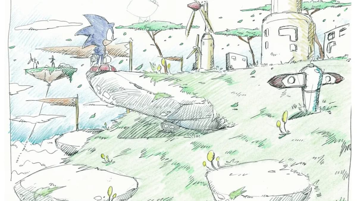
When Sega posted the archival sketches on its official Sonic channels, the gaming community got a rare glimpse into the visual brainstorming that preceded Sonic Adventure’s iconic launch. The early artwork, with its rounded Sonic silhouette, whimsical soot‑ball creatures and a more gothic Amy Rose, diverges sharply from the sleek, high‑speed aesthetic that ultimately defined the Dreamcast era. Such releases serve both as fan service and as a transparent look at how major franchises evolve, reminding audiences that beloved titles often pass through multiple artistic identities before settling on the final look.
The concept pieces also shed light on the turbulent development timeline that spanned two console generations. Initially conceived during the waning days of the Sega Saturn, the designs reflect the hardware’s limitations and a more cartoon‑centric approach. With the Saturn’s commercial decline, the project migrated to the Dreamcast, prompting a strategic overhaul led by art director Kazuyuki Hoshino, who pushed for a modern, edgy redesign. The shift coincided with a record‑breaking team of roughly 100 developers, positioning Sonic Adventure as one of Sega’s most ambitious undertakings and setting a benchmark that would soon be eclipsed by Yu Suzuki’s Shenmue.
Ultimately, the final Y2K‑infused aesthetic cemented Sonic’s brand identity for over 25 years, influencing everything from character animation to marketing tone. By contrasting the early concepts with the released product, analysts can trace how market pressures, platform capabilities, and creative leadership converge to shape a franchise’s visual language. For industry observers, the archive underscores the importance of flexibility in design pipelines and illustrates how legacy characters can be reinvented to stay culturally relevant while still honoring their roots.
Sega Drops Early Sonic Adventure Concept Art That Shows An Entirely Different Vibe
Comments
Want to join the conversation?
Loading comments...