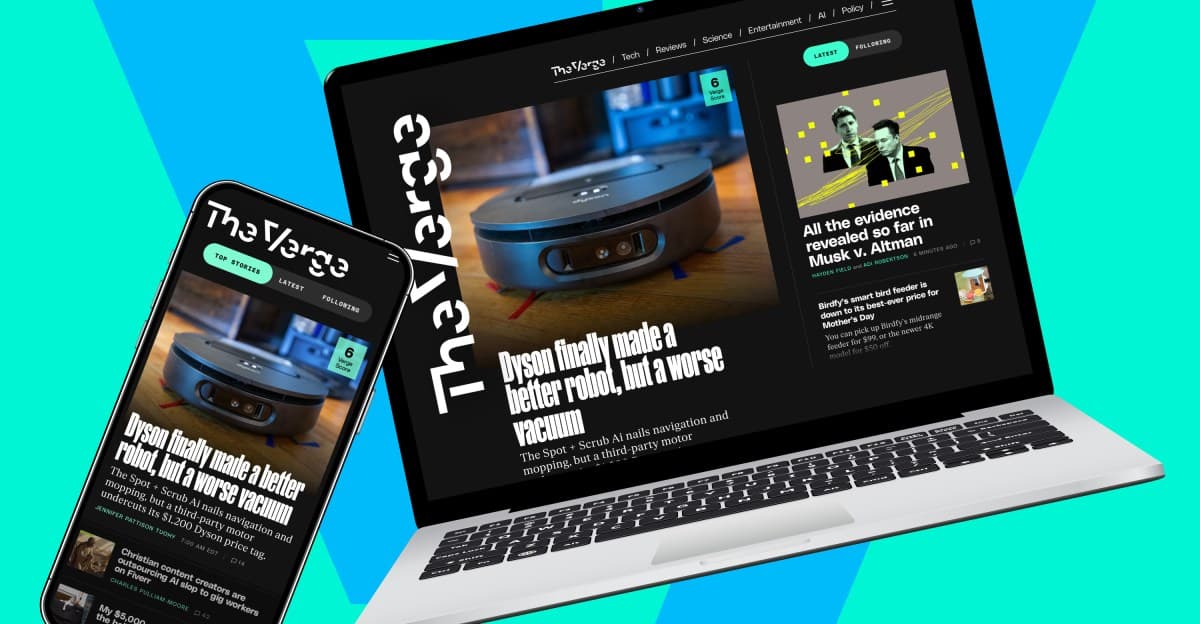
Why It Matters
The response shows how a major tech publication balances rapid bug fixes with longer‑term product strategy, directly affecting reader engagement and subscription value. It highlights the growing expectation for customizable, dark‑mode‑ready experiences in digital media.
Key Takeaways
- •Fixed scrollbar, "Read More" links, and bottom category links.
- •Dark mode is under active development after user demand.
- •Team will explore personalized read/unread markers for homepage.
- •Deprecated Free-to-Read and Subscriber Perks sections for now.
- •Structural changes postponed; mix of curated and firehose feed stays.
Pulse Analysis
Digital publishers increasingly treat their front pages as living products, iterating based on real‑time user data rather than static launches. The Verge’s recent homepage rollout illustrates this shift: after a brief rollout period, the editorial team collected granular feedback, sorted it into actionable buckets, and publicly disclosed which issues would be fixed immediately. This openness not only builds trust with a tech‑savvy audience but also creates a feedback loop that can accelerate feature adoption and reduce churn, especially for subscription‑driven sites that rely on sticky user experiences.
The most prominent themes emerging from The Verge’s feedback are usability bugs, demand for dark mode, and a desire for more personalized content controls. Quick wins—such as eliminating an errant scrollbar and adding "Read More" links—were deployed within days, demonstrating a responsive engineering cadence. Meanwhile, darker‑mode support, a staple for modern readers, is earmarked for a near‑future release, reflecting broader industry pressure to accommodate low‑light environments. The request for read/unread markers signals a push toward a more tailored homepage, aligning with trends seen at platforms like Medium and Reddit where users expect granular content management.
Balancing these enhancements against limited team capacity underscores a common challenge for niche media outlets: delivering innovative features without compromising editorial focus or business priorities. By deferring larger structural overhauls—such as reworking the curated‑plus‑firehose layout—the site preserves its core content strategy while gathering longer‑term data on user preferences. This pragmatic approach allows The Verge to iterate responsibly, ensuring that future redesigns are grounded in proven demand rather than speculative ideas, a model other publishers can emulate as they navigate the evolving expectations of digital news consumers.
What we’re hearing about the new homepage
Comments
Want to join the conversation?
Loading comments...