

Automate Repetitive Financial Models to Eliminate Hidden Errors
I've built a whole career on the fact that every financial model has an error in it somewhere. Caught most of mine before the board meeting. Caught one, famously, a few days after. And nobody's being careless. We rebuild the same process by hand every single month Now imagine if the repetitive work turns into code you can open and check and it only rewrites itself when something changes. I’ve started a list of what i’m going to hand over
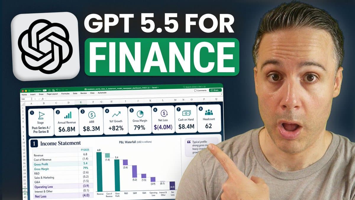
ChatGPT 5.5 Dazzles with Excel Visuals, Falters on Full Model
ChatGPT 5.5 told me it would beat Claude for Excel work. So I made it prove it. https://t.co/nHK9PPcSSZ For context — last time I tested ChatGPT on a financial model, I was underwhelmed. So I went into this skeptical. ChatGPT 5.5 surprised me. At least...
Free QuickBooks Online Cheat Sheet From Top Finance Leaders
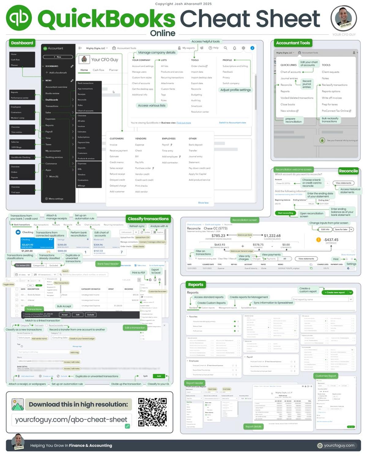
Quickbooks Online Cheat Sheet 🤓 Learn how to navigate one of the most widely used software’s in Finance & Accounting === We asked 9 of the top finance leaders to open their playbooks. They said yes. Spots are limited. I'd grab one. Register for free:...
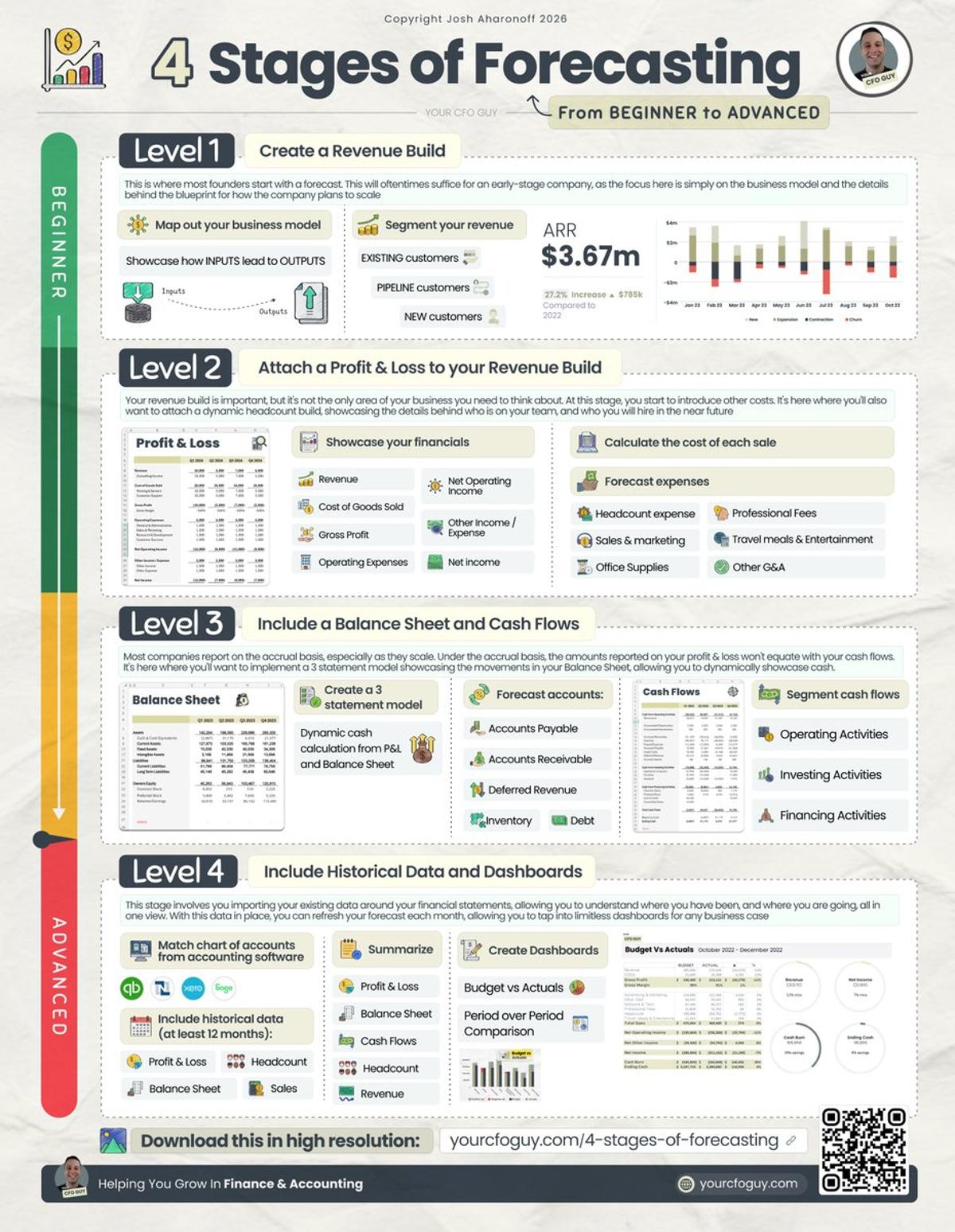
Most Startups Stall at Level 1 Forecasting.
The 4 Stages of Forecasting from BEGINNER to ADVANCED === We asked 9 of the top finance leaders to open their playbooks. They said yes. Spots are limited. I'd grab one. Register for free: https://t.co/P5XyaqkF5g === Which stage is your business at🪜? Every month, I meet with...
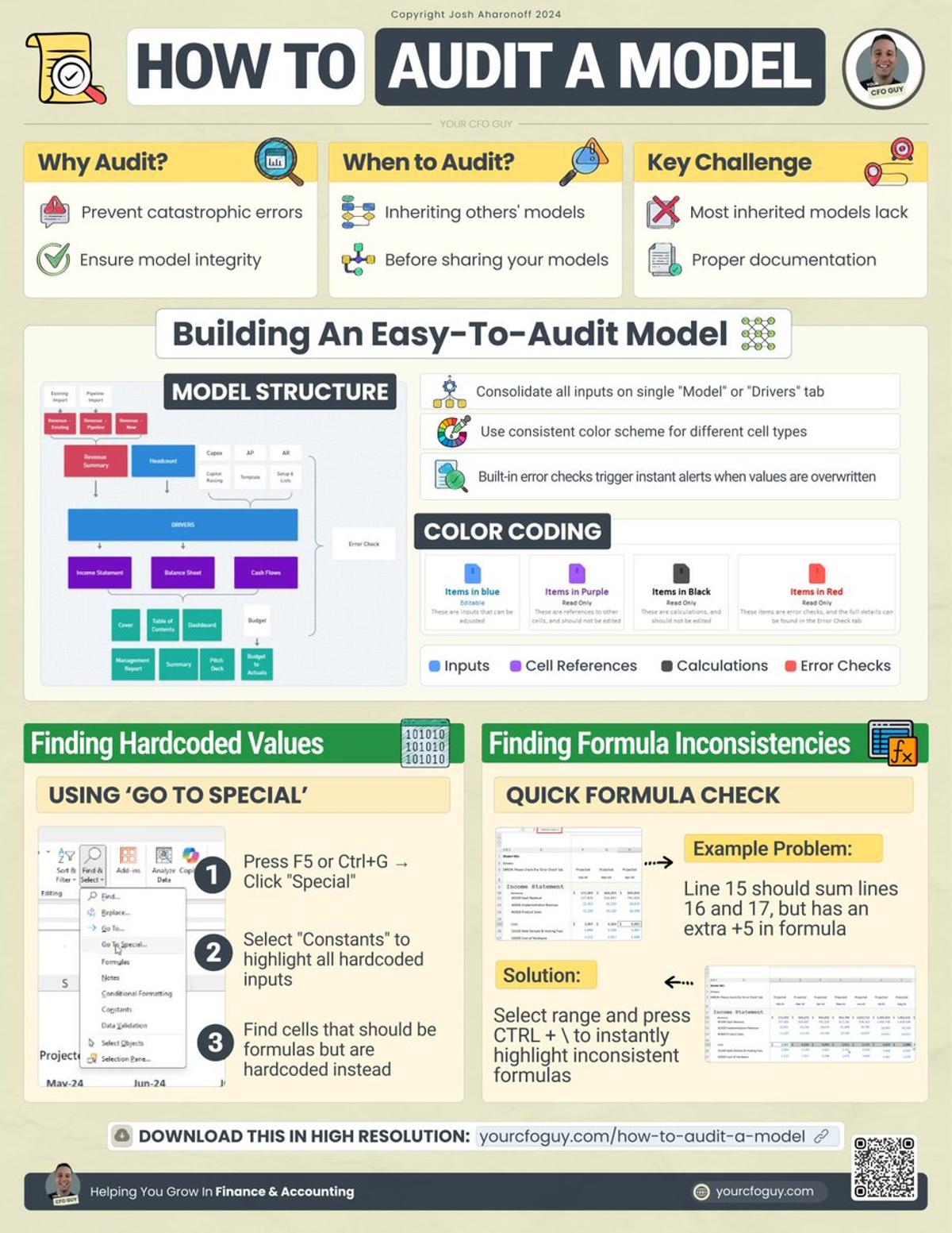
Audit Every Financial Model to Avoid Career‑Costly Mistakes
How to Audit a Financial Model 🕵️♂️ Building a financial model is only half of the game... === We asked 9 of the top finance leaders to open their playbooks. They said yes. Spots are limited. I'd grab one. Register for free: https://t.co/P5XyaqkF5g === Most of the...
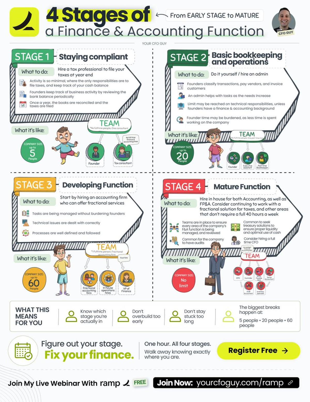
Match Your Finance Function to Company Size for Efficiency
There are 4 stages of a finance and accounting function. Most companies are running the wrong one for the size they're at right now. On May 8th at 1 PM ET, I'm going live with Ramp during their Small Business Week...
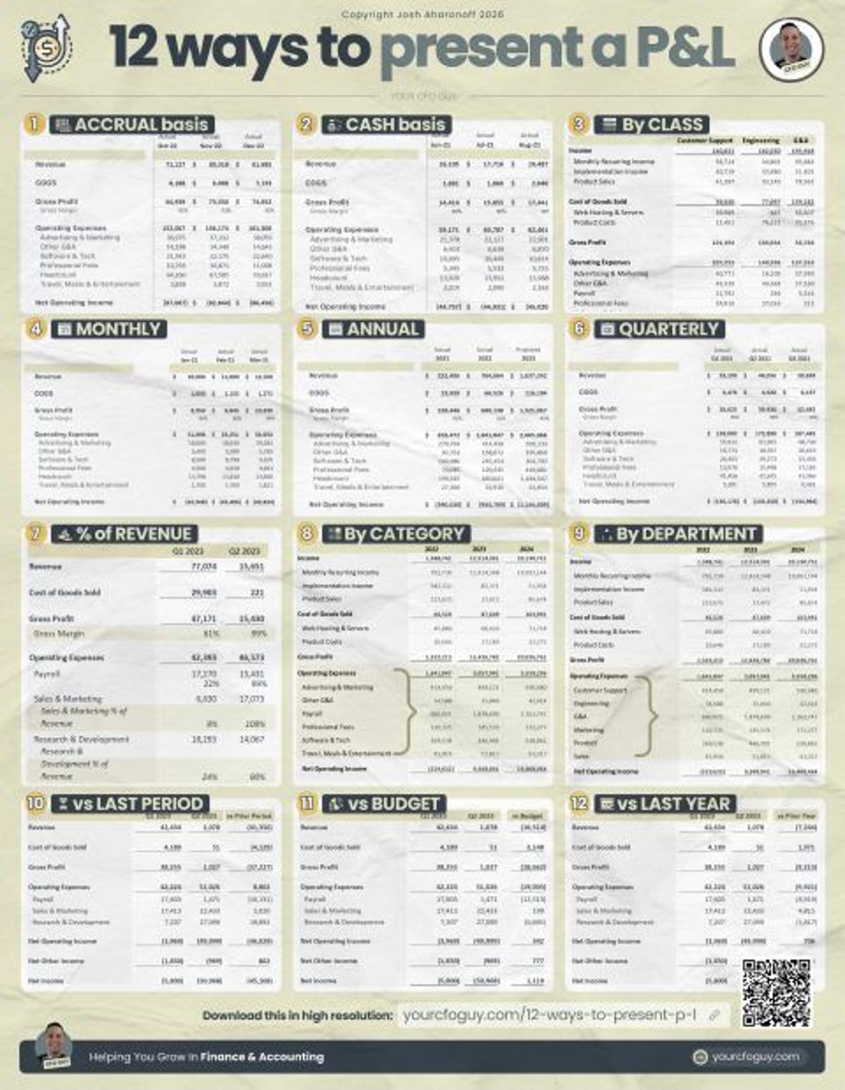
12 P&L Views: Choose the Right Perspective
12 Ways to present a P&L 1. 📔 ACCRUAL basis ❔ What it is → showcases income when earned, expenses when incurred 💡 Why it’s valuable → gives you a more practical understanding of what’s actually happening 2. 🤑 CASH basis ❔ What it...
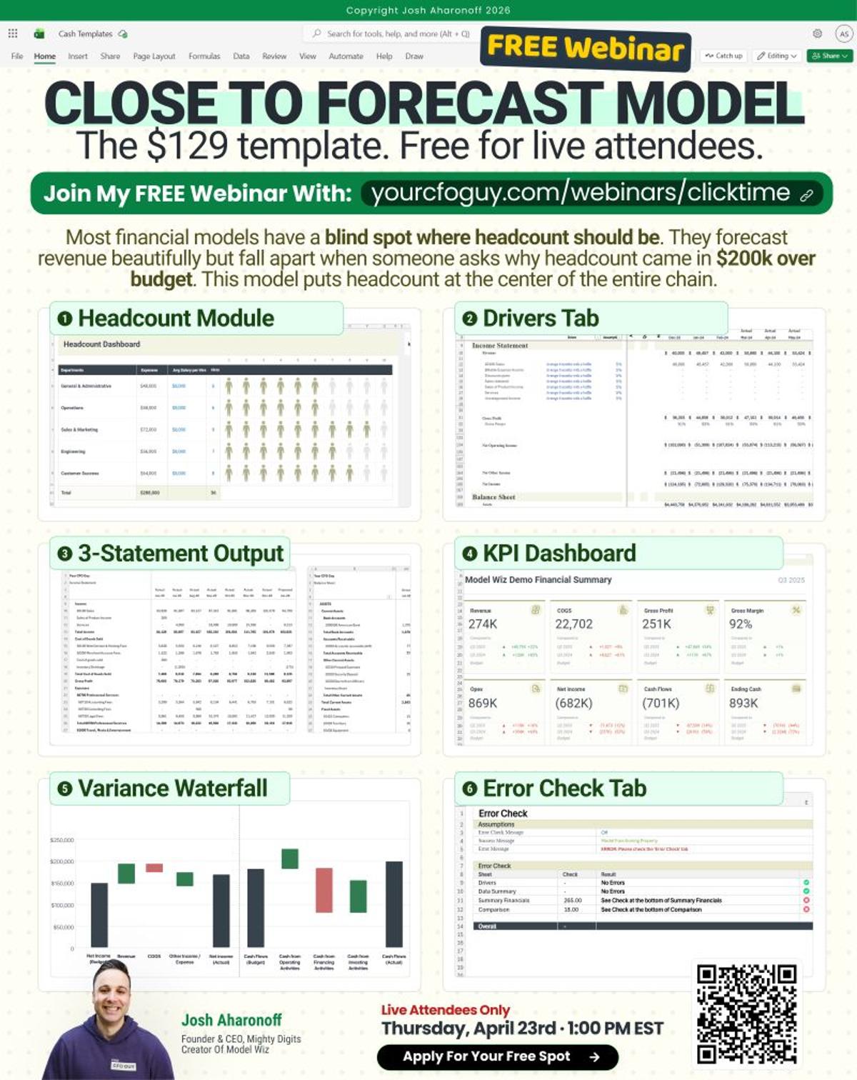
Free Forecast Model Puts Headcount at Core, Shows Detailed Variance
I'm giving away my full close to forecast model. Worth $129. Register for my live training on April 23rd and it's yours 👉 https://t.co/iFBeytIbFx Most financial models have a blind spot where headcount should be. They forecast revenue beautifully. They project cash flow cleanly. But...

Spotlight Dashboards: One Metric, Perfectly Displayed
Most dashboards try to show everything. The best ones show one thing perfectly. I call this the Spotlight dashboard. Here's the idea. Someone asks "how's cash looking?" You don't dig through 5 tabs. You don't open 3 reports. You don't start sweating while...
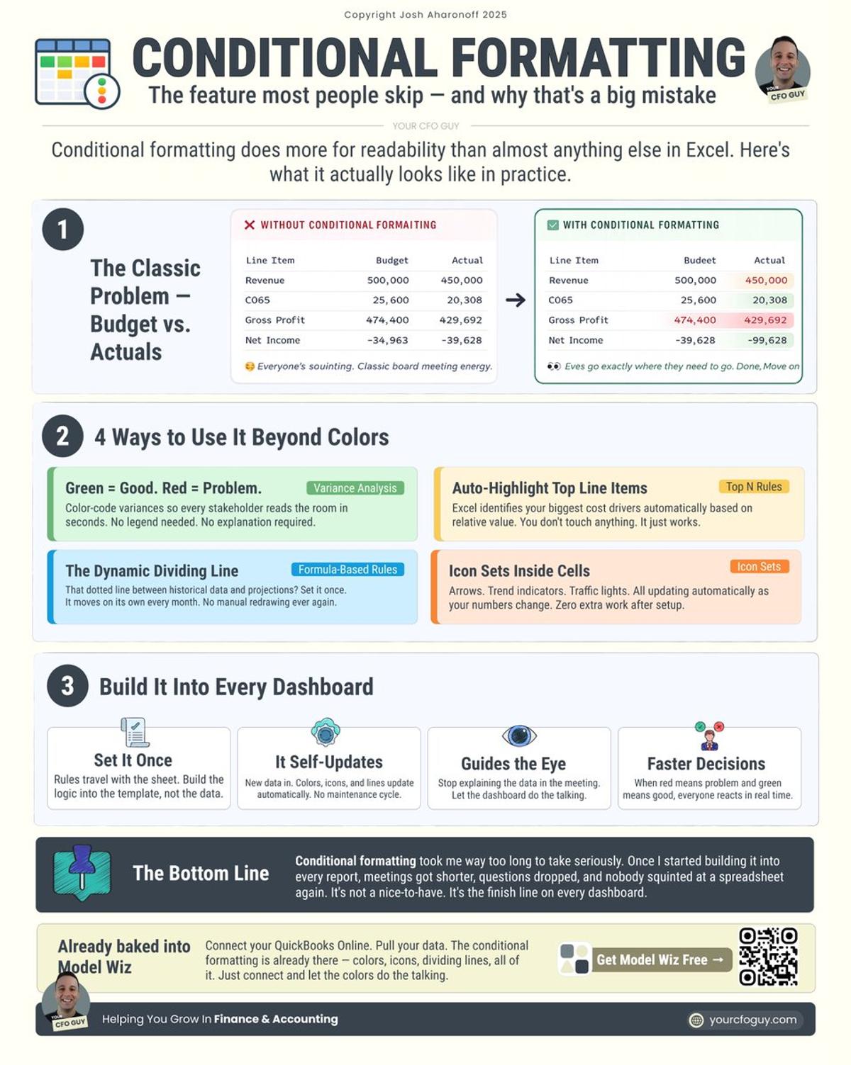
Conditional Formatting Turns Boring Dashboards Into Insightful Visuals
Conditional formatting changed how I build every dashboard. And most people barely touch it. I get it. It sounds boring. Even the name puts people to sleep. But here's the thing. This one feature does more for readability than almost anything else...
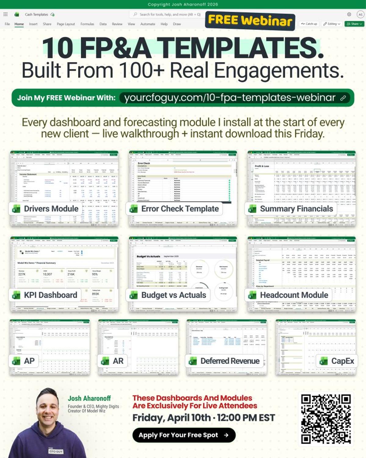
Free Real‑World FP&A Dashboard Pack for Startups
It took me 100+ client engagements to perfect the FP&A system I use today 10 dashboards and forecasting modules. Every one built from real startup work. Worth $249. Yours for free. This Friday I'm walking through all 10 and handing them to you...

Link All Three Statements to Avoid Cash Crises
Every small business should have a 3 statement model. Most don't. Here's why that's a problem. I see this all the time. Business owner pulls up QuickBooks. Looks at the P&L. "Revenue's up. Expenses look fine. We're good." Two weeks later they're scrambling...

Design Beats Data: Clean Visuals Drive Executive Buy‑in
I believe design often matters more than data. Controversial? Maybe. But I've seen too many great analyses get ignored because the spreadsheet looked like a mess. Here's what I mean. You spend hours building a model. The numbers are perfect. Every formula...

Free ARR Dashboard Reveals Hidden Growth Metrics
This ARR dashboard is one of our best selling templates at $63. It tracks 20+ SaaS metrics at monthly, quarterly, and annual granularity. Today you can have it for free 👇 https://t.co/U664G2r5QL I manage 35 to 40 SaaS startups as a fractional CFO. And I...

Instant Business Health Check in One Red‑Green Dashboard
This dashboard tells you if your business is healthy in 5 seconds. No digging required. I kept hearing the same question from CEOs. "Are we doing okay or not?" Simple question. Never a simple answer. "Well, revenue is up, but margins are down,...