

One Harsh Sentence Drove Talent Away From Government Job
One sentence from his boss made him walk away from a prestigious government job. He's been with me for 6 years since. Here's what happened. I found the perfect hire. He was working with me part time as a contractor, and I could see it right away. Raw talent. Work ethic. The kind of potential you just can't teach. So I offered him a full time position. He said no. Turns out, he had just accepted a prestigious government job. Stable. Respected. The kind of gig you don't walk away from. I get it. I was crushed. Thought I'd missed my shot. Then, two weeks later, he messaged me: "I'm ready to work for you full time." Wait, what? I had to read that twice. Here's what happened. "My boss wasn't there," he explained. "There was no work to do, so I figured I could go home. When he found out, he called me, very aggressively, and said, 'If you don't come back right now, don't bother coming back on Monday.'" One sentence. That's all it took for him to walk away. Now here's the thing. This wasn't some toxic startup with a 25-year-old founder screaming about hustle culture. This was a respected government position. Good pay. Job security. The whole package. But none of that mattered after one bad conversation. Two weeks on the job and he was done. I think about that a lot. Not because I'm some perfect manager. Trust me, I've screwed up plenty. But because it showed me how little it takes to lose someone great. And how little it takes to keep them. I've been running my firm for over six years now. Hired over a hundred people. And the ones who stayed the longest? It wasn't always about the money. It was about how they felt when they talked to me. That contractor I almost lost to a government job? He's now my CTO at Model Wiz. The guy building the product that helps finance teams automate their dashboards and reporting. Funny how things work out. One boss lost him over a single sentence. I've kept him for 6 years by watching mine. What's the last thing you said to your team today?

Unlock Excel Checkboxes for Instant Dashboard Updates
Excel has checkboxes. Most finance teams have no idea. Here's what they're missing. Not filters. Not dropdowns. Checkboxes. Click a box. Dashboard updates. That's it. Sounds simple because it is. Let me show you two dashboards where this actually matters. First one. Comparison Dashboard. Check...

Automate Financial Model Checks to Prevent $2M Mistakes
Your financial model has an error right now. You just haven't found it yet. I know because I've been there. I once spent days building a model for a client. Board meeting. Next 12 months of projections. Felt great about it. Then a...

Icon Grids Make Headcount Instantly Understandable
This headcount format gets the fastest "got it" from every board I've presented to. Here's the thing about tables. They work. But nobody remembers them five minutes later. You say "Sales has 72 people." Board nods. Next slide. Already forgotten. But when you...

Keep P&L Simple: One Page, Clear Story
I've built P&Ls for 100+ companies. The best ones all look like this. Simple. Clean. Boring, even. And that's the point. I used to overcomplicate everything. 50 accounts. Color coded sections. Fancy formatting. Looked impressive. Nobody understood it. Including the CEO who was...

CEOs Prefer Trailing‑12‑month Dashboards over Monthly Noise
I've built dashboards for 100+ companies. This is the one CEOs actually open every week. Not because it's fancy. Because it answers the question they actually care about: are we growing or is it just seasonality? Let me explain. Monthly sales numbers lie...

AI Is Already Replacing 80% of Junior Analysts
AI can do 80% of junior analyst work right now. And it's coming for mid-level next. Here's how to stay relevant. I've been thinking about this a lot lately. Everyone says advisory is safe because it's about relationships and "professional touch." I...
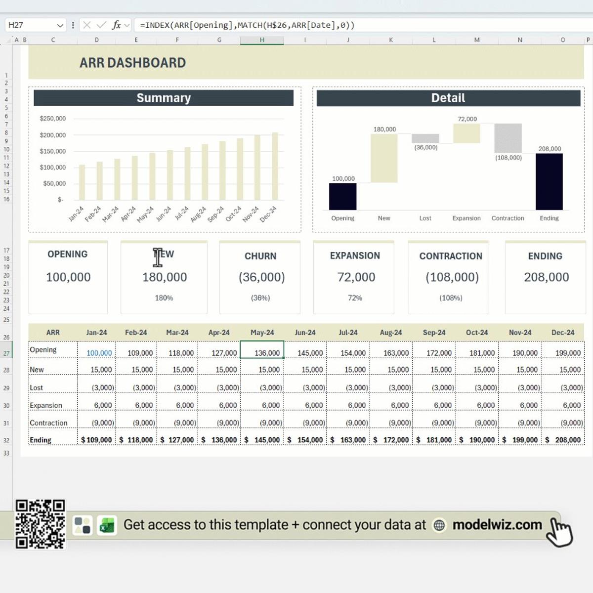
ARR Hides Five Metrics; Track Them All
Most SaaS founders know their ARR. Very few can explain where it came from. I've sat in dozens of board meetings where someone says "ARR is up 20%" and the room nods. Then a board member asks "how much of that...
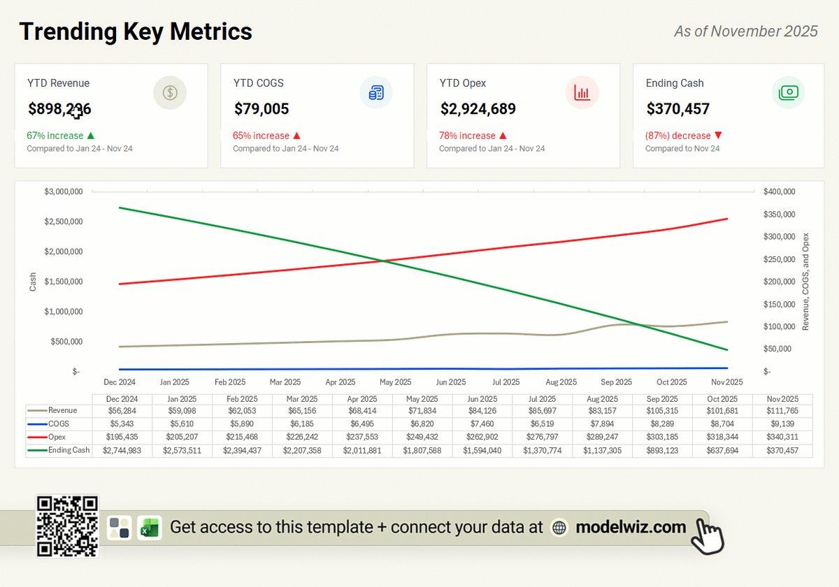
Instant Cash Insight: One Dashboard Beats Spreadsheet Chaos
"How's cash looking?" If that question makes you nervous, you need this dashboard. Every finance leader gets asked this. Most scramble for the answer. Let me show you what I mean. Four KPIs at the top. Revenue, COGS, Opex, Ending Cash. Each one...
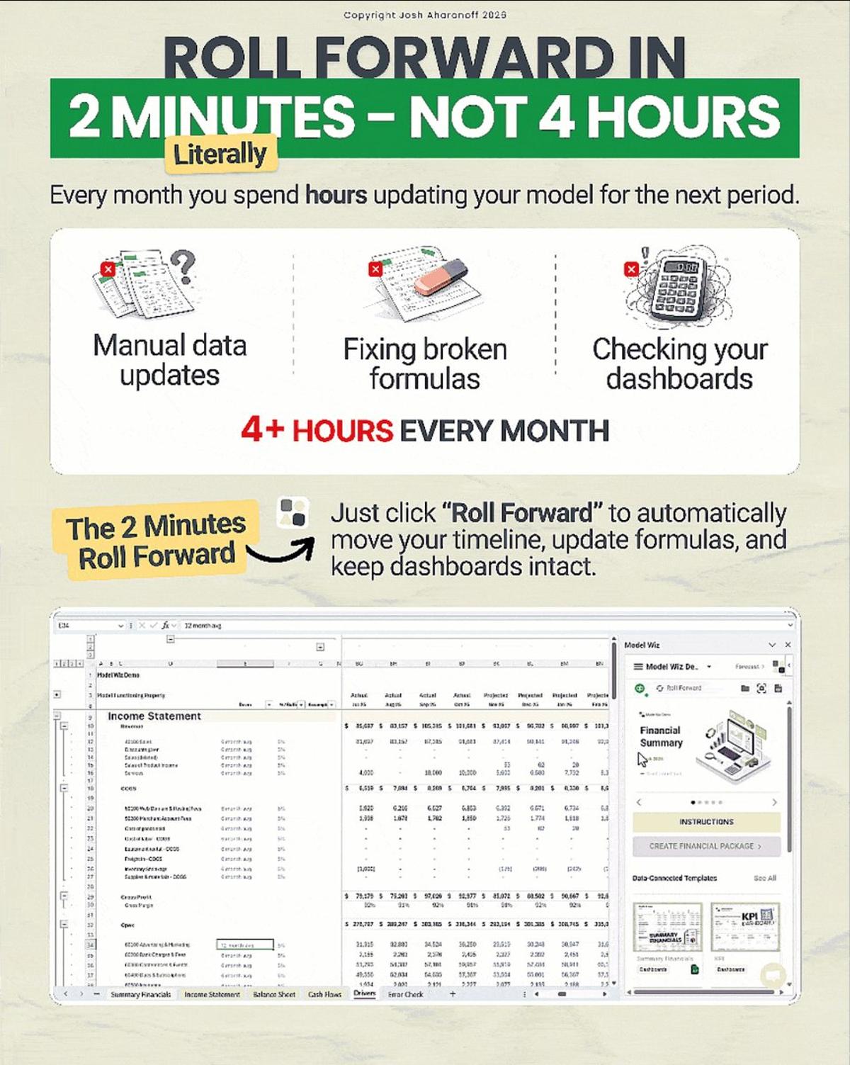
Build Resilient Models: Separate Data, Use Named Ranges
I used to lose an entire day just updating last month's numbers. Not because the model was complicated. Because I hadn't built it to survive the roll forward. Most models break the same way every month. A new account shows up that...
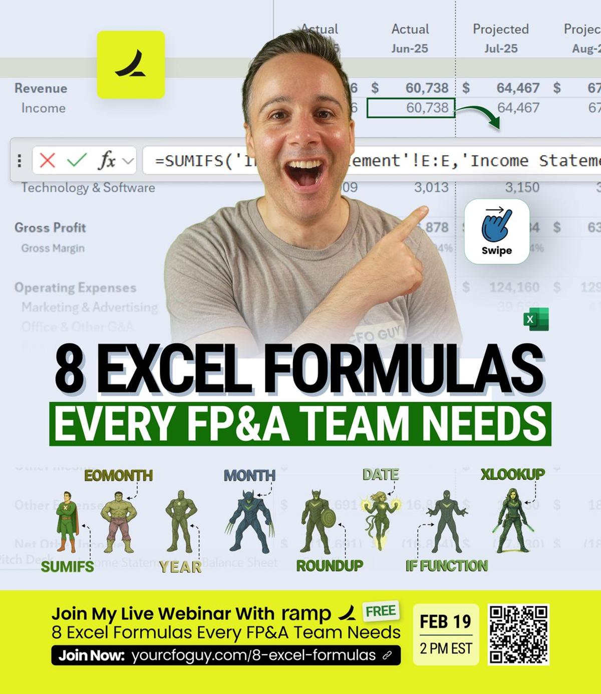
Eight Formulas Cut Reporting From Hours to Minutes
They told me their reports take 6 hours. I showed them 8 formulas. Now it takes 10 minutes. Join my free masterclass with Ramp on February 19th 👉 https://t.co/Aw0QFfIbL0 I've seen this pattern dozens of times. Smart FP&A teams. Good analysts. Solid finance...
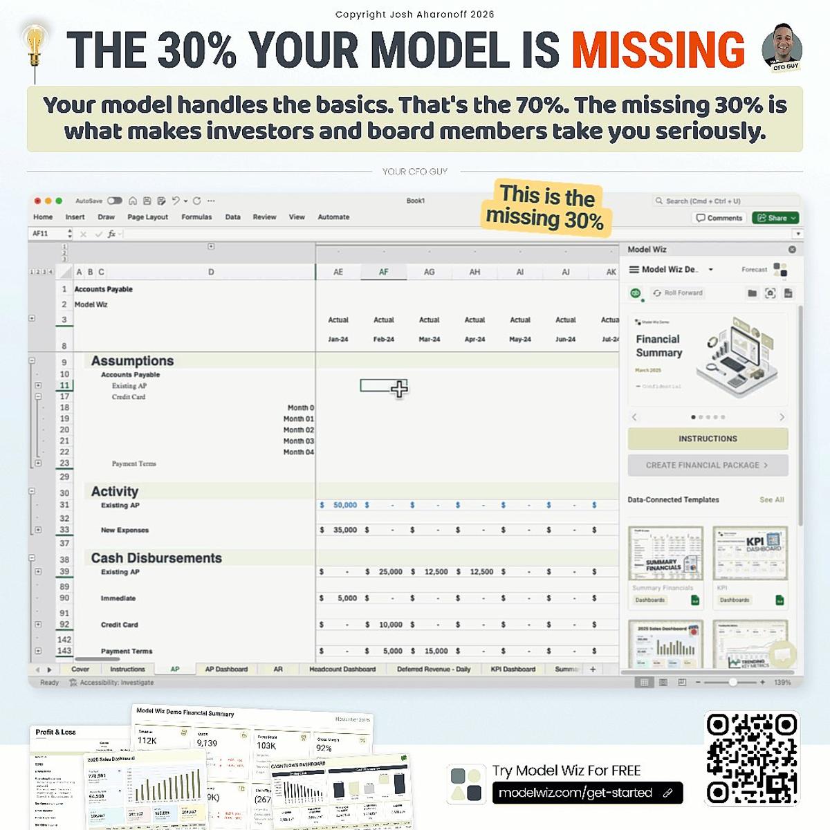
Add 30% Detail to Make Financial Models Credible
Your Model is 70% There. Here's What's Missing. Most VPs of Finance I work with have a solid financial model. P&L looks good. Balance sheet ties out. Cash flow makes sense. But when the board starts asking harder questions, the model falls short. "What...

Add Three Essential Tabs to Prevent Model Errors
Your financial model has vulnerabilities. You just don't know where yet. Get the financial model template from this video https://t.co/k8GYiP9Ubg After building hundreds of financial models and training hundreds of people across the globe, I keep seeing the same three tabs missing. Without them,...