5 Top Data Visualization Tools for Research Projects
Why It Matters
Effective visualization accelerates insight discovery and improves communication of complex research findings, giving institutions a competitive edge in funding and impact. Choosing the right platform directly influences analytical depth, collaboration efficiency, and audience engagement.
Key Takeaways
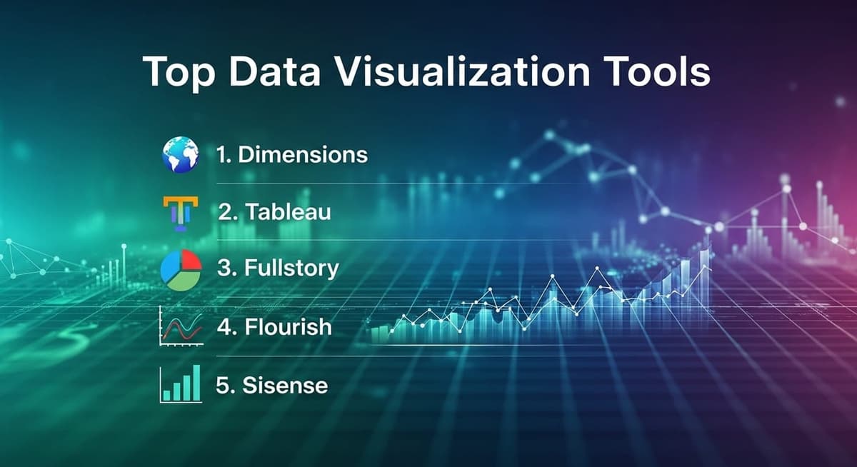
- •Dimensions integrates VOSviewer for bibliometric network analysis.
- •Tableau offers drag‑drop dashboards with extensive data source connectivity.
- •Flourish provides template‑driven, no‑code interactive storytelling.
- •Sisense leverages AI for scalable, embeddable analytics.
- •Choose tools based on data handling, ease, and cost.
Pulse Analysis
Data visualization has become a cornerstone of modern research, turning massive, multi‑dimensional datasets into actionable narratives. As academic and corporate labs grapple with ever‑growing data volumes, platforms that combine intuitive interfaces with robust analytical engines are essential. No‑code environments lower the barrier for domain experts, while AI‑enhanced features automate pattern detection, enabling faster hypothesis testing and more compelling presentations for stakeholders.
Among the highlighted solutions, each serves a distinct niche. Dimensions, paired with VOSviewer, is tailored for bibliometric analysis, helping scholars map citation networks and identify thought leaders. Tableau remains the industry standard for interactive dashboards, prized for its seamless data blending and vibrant community resources. Fullstory’s session‑replay technology offers granular user‑experience insights, valuable for behavioral research, whereas Flourish’s template library empowers researchers to craft narrative‑driven visual stories without programming. Sisense stands out with AI‑driven analytics and embeddable widgets, supporting large‑scale, real‑time data exploration across enterprises.
When selecting a visualization tool, researchers should weigh data compatibility, scalability, and collaboration features against budget constraints. Open‑source or freemium tiers can suffice for early‑stage projects, but enterprise deployments often demand advanced security and integration capabilities. Looking ahead, the convergence of generative AI and visualization promises automated chart generation and natural‑language insights, further democratizing data literacy across research domains. Organizations that adopt adaptable, AI‑augmented platforms will unlock deeper insights and accelerate the translation of findings into real‑world impact.
5 Top Data Visualization Tools for Research Projects
Comments
Want to join the conversation?
Loading comments...