

U.S. Large‑Cap Stocks Overpriced by 176% Historically
Large caps are extremely expensive, well beyond 3 standard deviations above average, but back a little from last year's all-time high. These two charts come from long-run valuation work (Advisor Perspectives / Crestmont style datasets) and show how expensive the U.S. equity market is relative to its historical norms using multiple valuation measures. The chart averages four well-known valuation frameworks relative to its long-term geometric average: * Crestmont P/E: 197% above average * Shiller CAPE (Cyclically Adjusted P/E): 142% above average * Tobin’s Q: 167% above average * Market value vs regression trend: 196% above average Average of all four: +176% above average

Growth Dominance Hits 30‑Year High, May Be Peaking
We are moving away from the most extreme growth-over-value cycle peak in modern history. On a relative basis, the expensive vs. value ratio is now back to the 2021 Meme stock peak, which was then higher than at any...
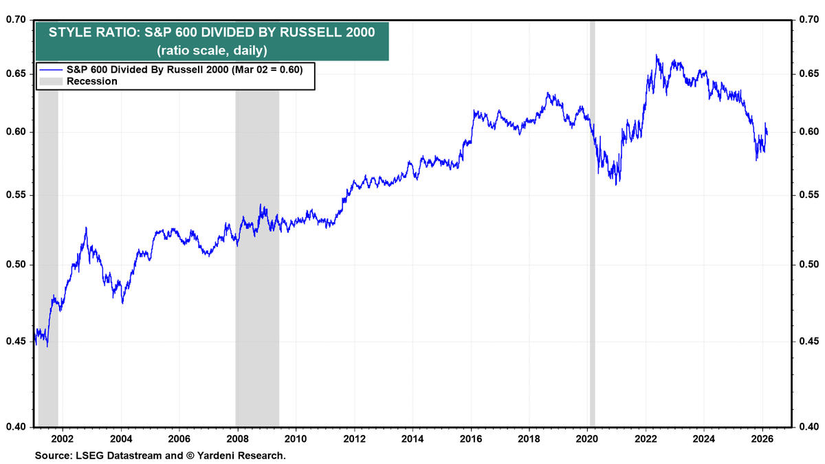
Quality Small Caps Outperform Junkier Russell 2000 Over
This chart plots the ratio of the S&P 600 Index divided by the Russell 2000 Index from the early 1990s to today. Russell 2000 = 2000 “small caps” by market cap, inclusion rules are mostly mechanical and allow many...
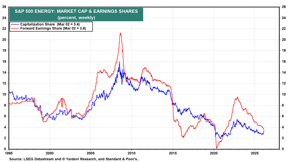
Energy Cheap and Underweight; Oil Upswing Could Boost Index
This chart shows Energy’s weight in the S&P 500 over time in two dimensions: * Blue line = Energy’s market cap share * Red line = Energy’s forward earnings share Current readings (Mar 2): * Market cap share ≈ 3.4% * Forward earnings share ≈...

Cyclicals at 25% Signal Upcoming Market Inflection
Each time this cluster reached ~44%, it represented extreme global concentration in growth/quality sectors. Historically, that 24–25% zone has marked secular lows in cyclicals/value share. When financials/energy/materials are ~25%: * They are structurally under-owned. * Valuations tend to be compressed. * Expectations are low. In 2000...
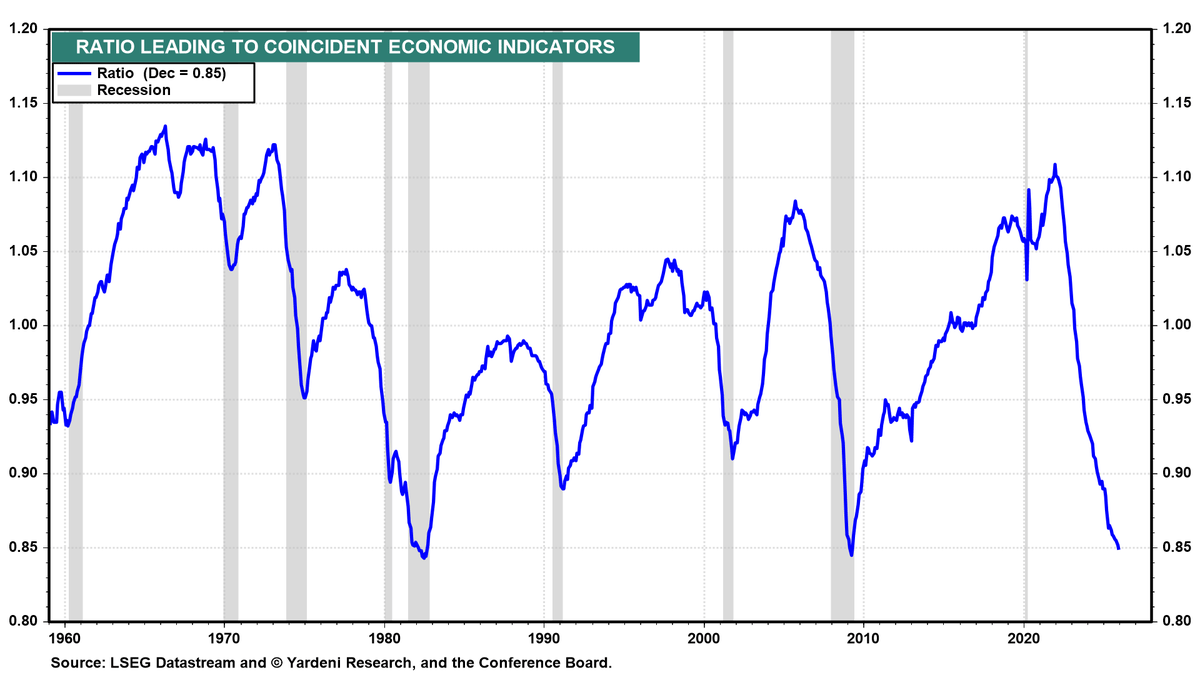
LEI/CEI Ratio Hits 60‑Year Low, Forecasting Recession
Every recession since 1960 has been preceded by a material downturn in this ratio. Today’s reading is squarely in that danger zone. These charts show the Leading Economic Index (LEI) against the Coincident Economic Index (CEI). The shaded bars...
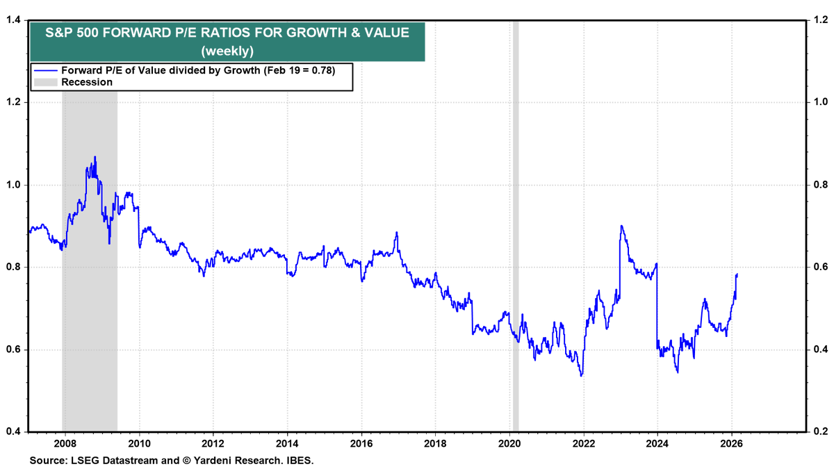
0.78 Ratio Signals Modest Value Edge, Not Explosion
The blue line is Forward P/E of Value divided by Growth: * 1.0 = Value and Growth trade at the same forward P/E. * <1.0 = Value trades cheaper than Growth. * Lower = wider valuation spread favoring Growth. Historical 3–5 Year Returns: * When...

Tepper Dissects Markets, AI, Capitalism, and Crisis
Our chat with Jonathan Tepper on: * Building a Dominant Long-Only Fund in a Distorted Market * Buying Booking at Peak Fear: COVID, Google & Mispriced Risk * Will AI Disintermediate the Platforms? * AI Winners, Losers & the SaaS Apocalypse * The Myth of...

Value Investing Shifts: Beyond Wealth, New Picks, Plateau
This week in value: @GSpier : What Really Counts in Life — Beyond Wealth and Returns @bogumil_nyc Pzena – The Value Stocks to Watch 2026 @PzenaInvstmtMgt ) Semper Augustus 2025 Letter: Cloud Delusions; Value at a Secular Plateau; And – Berkshire Hathaway:...
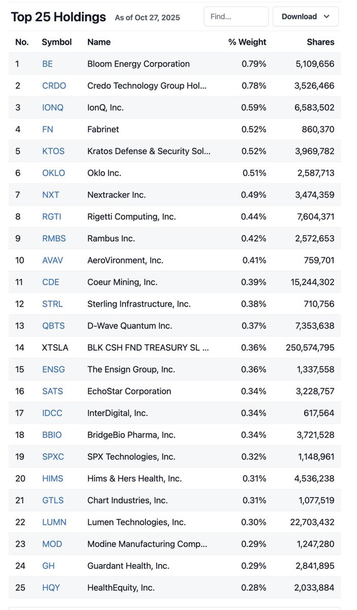
Russell 2000 Shifts From Tech to Industrial/Defense
Russell 2000 $IWM top 25 holdings. Shows a meaningful shift from early Q4 last year. Top holdings have rotated from speculative tech optionality toward industrial/defense/capex cyclicals over the past few months. https://t.co/c24tFJQjc5

Flatbed Rejection Spike Signals Bullish Industrial Growth
This is an extreme spike in the SONAR Truckload Rejection Index – Flatbed (STRIF.USA) from 2018–2026. A 40% rejection rate means: * Strong industrial throughput * Tight labor + equipment capacity * Improving pricing power in physical economy * Early/mid expansion phase dynamics It usually leads: *...
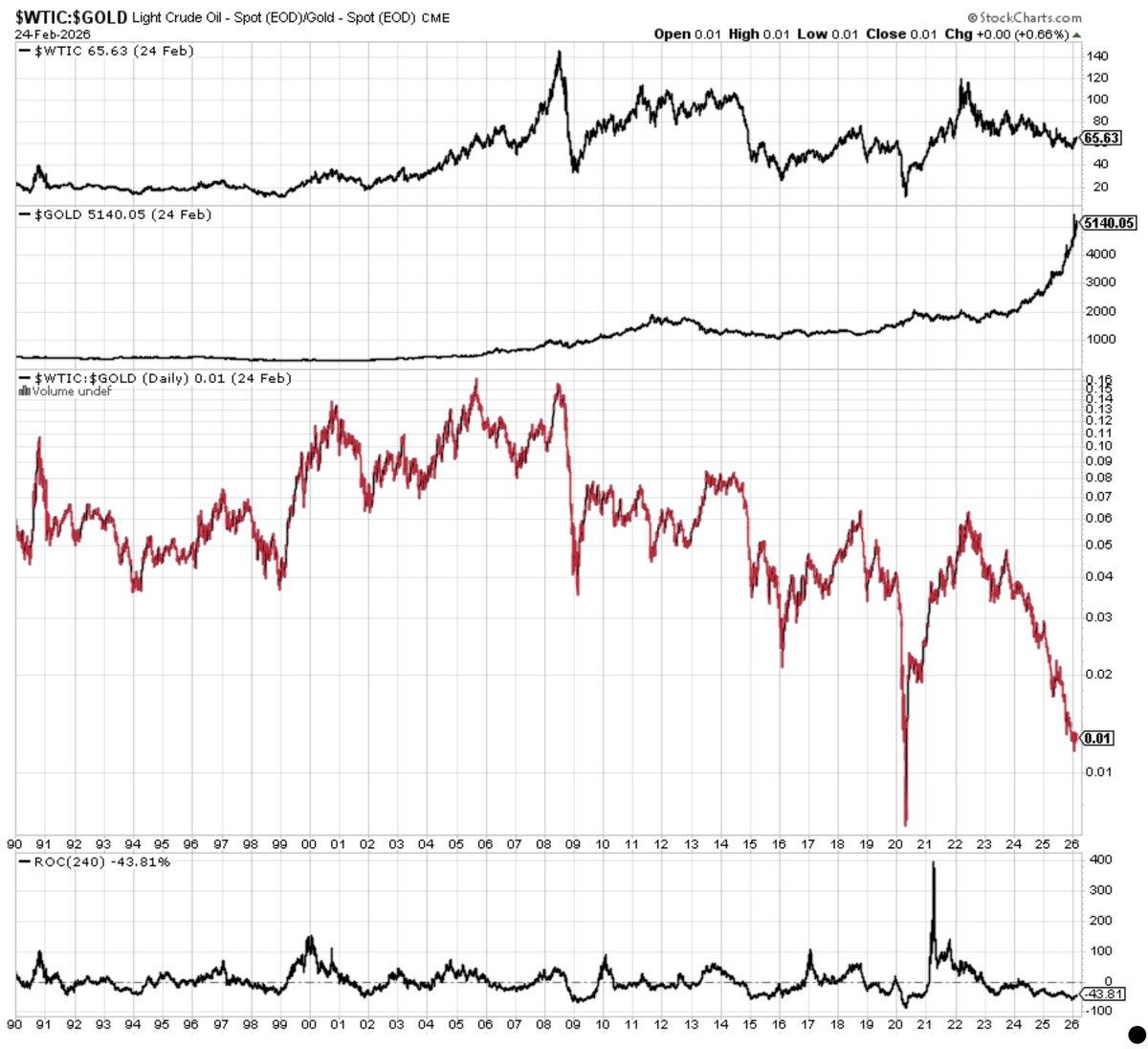
Depressed Oil‑Gold Ratio Signals Multi‑Year Energy Outperformance
Oil peaked in 2008 at $140 and has fallen sideways since to ~$65 today. In hard-money gold terms, 1 ounce buys 100 barrels of oil. Oil has been deflating for decades. The only time it was cheaper was 2020 when...

High‑Momentum Tech Overvalued, Risky If Market Weakens
Tech momentum is stretched. If macro weakens or earnings disappoint, crowded high-momentum tech could unwind quickly. This chart shows the performance and valuation of a high-minus-low (H–L) momentum factor within Russell 1000 Tech. Top Panel: H–L Momentum = Long Q1 (top momentum...
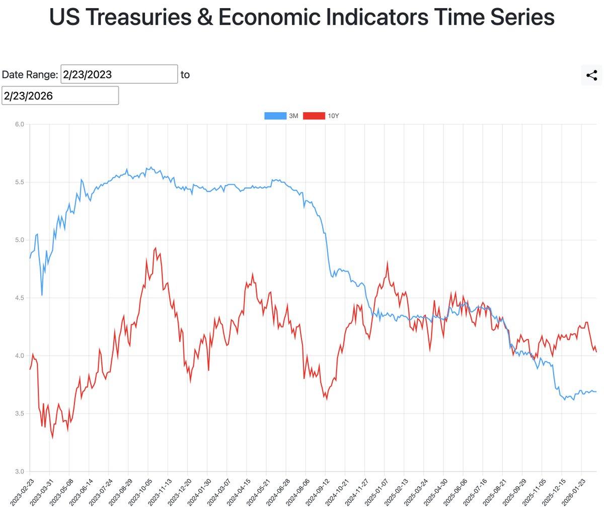
Yield Curve Shifts From 2023 Inversion to 2025 Flattening
Chart shows the shape and evolution of the yield curve (3-Month Treasury yields (blue) and 10-Year Treasury yields (red)) from Feb 2023 to Feb 2026. It's been a wild ride from the extreme inversion in 2023 to normalization beginning Q4 2025....
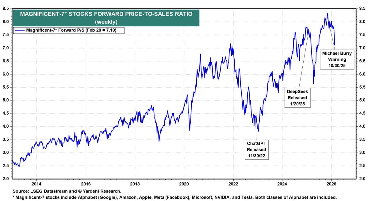
Mag 7 Forward P/S Ratio Returns to 2021 Peak
Mag 7 forward price/sales ratio now back to the 2021 peak of ~7.1. * 2013–2020 average ≈ ~3.8–4.2x * Including bubble years (2020–2021 + 2024–2025) average ≈ ~4.5x https://t.co/AfvDJpv0iW
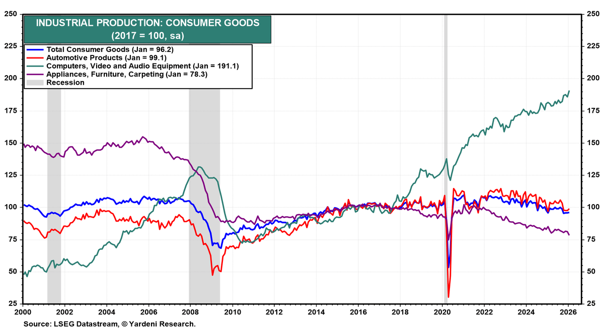
Green Tech Production Quadruples, Outpaces All Consumer Goods
Technology production (green) * ~50 in 2000 * ~190 today Nearly a 4x increase over 25 years This is the only category with powerful long-term structural growth. It recovered strongly after 2008 and exploded again post-2020. Everything else? Mostly flat. Industrial Production: Consumer Goods (2017...
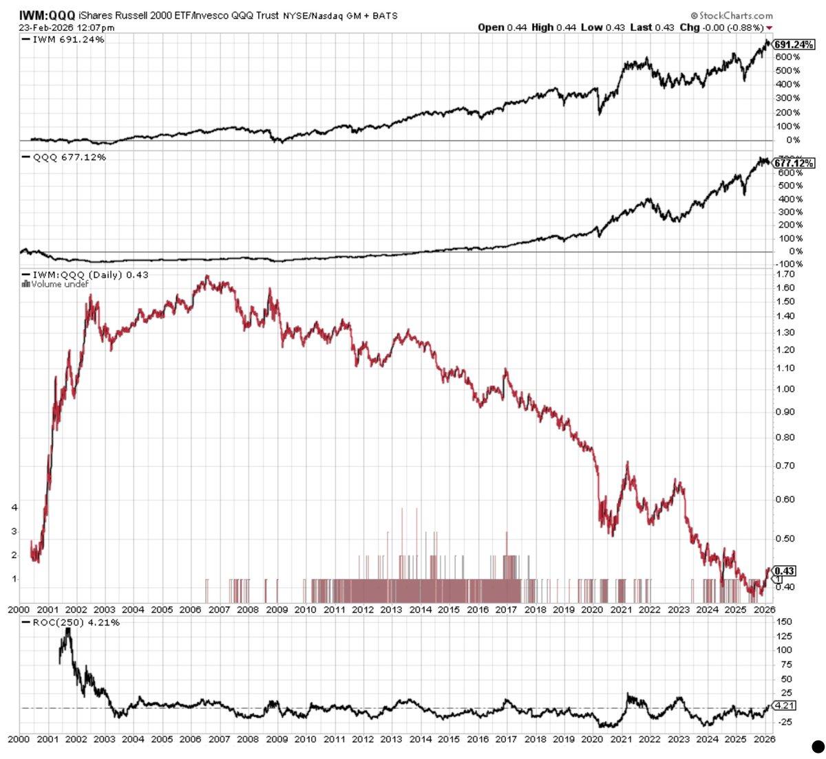
Small‑cap Value Poised for Violent Surge Post‑tech Dominance
Russell 2000 $IWM slightly ahead of Nasdaq $QQQ since 2000 and now ahead year-on-year. But the path was dramatic. From 2000–2006 → Small caps crushed tech after the dot-com bust Since 2006, small caps have underperformed large-cap growth for two decades, and severely...

Emerging Markets Still Offer Cheap Value Opportunities
Emerging markets portfolio manager Juan Torres on: * Where the Real Emerging Markets Value Is * If US Stocks Fall, What Happens to Emerging Markets? * Should You Hedge Emerging Markets Currency Risk? * Is Buying the Dip Still Smart? * Emerging Markets Outlook: Cheap or...